 2...4...6...8...10...12 Years
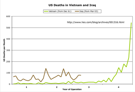
Sometimes pictures (OK, graphics) have more power than words. That is certainly the case with this set of graphs from lies.com that break down U.S. casualties from Iraq and Vietnam as a function of the number of months and years of involvement.
The graph at the right shows how much higher the U.S. death rate is in Iraq at a comparable time in the span of the operation.
Certainly, there are significant differences between our current deployment in Iraq and the Vietnam War. But, considering the open ended nature of the commitment and the complete failure of the Bush Administration to face the reality of the situation in Iraq the casualty curves look all the more ominous.
Take a look at all of the graphs over at lies.com.
 2...4...6...8...10...12 Years


<< Home